Org chart software: how to pick one that stays accurate
Two very different products are sold as org chart software. One makes a picture, the other maintains itself. Here's how to tell which one you actually need.

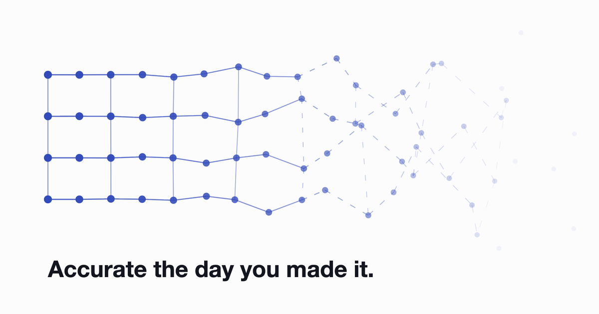
Every org chart is accurate the day it's made. That's the whole problem. Someone joins, someone moves team, someone quietly picks up a project that isn't in their job title, and the file in the shared drive is wrong within a month. Nobody notices, because nobody opens it. Then a new hire asks who owns billing and gets three different answers.
So when you're comparing org chart software, the feature list matters less than one question: what happens to this chart in six months? Most of the tools sold under that name answer it very differently, and the category name hides the difference.
Two different products share one name
Search for org chart software and you'll get two kinds of results wearing the same label.
Drawing tools are diagram makers. Visio, SmartDraw, Creately, Miro, or a slide in a deck. You place the boxes, you connect the lines, you control exactly how it looks. They're genuinely good at what they do, and what they do is produce a picture.
Living directories generate the chart from employee data instead. You don't draw anything. The structure comes from whatever already knows who works here, and the chart changes when that data changes.
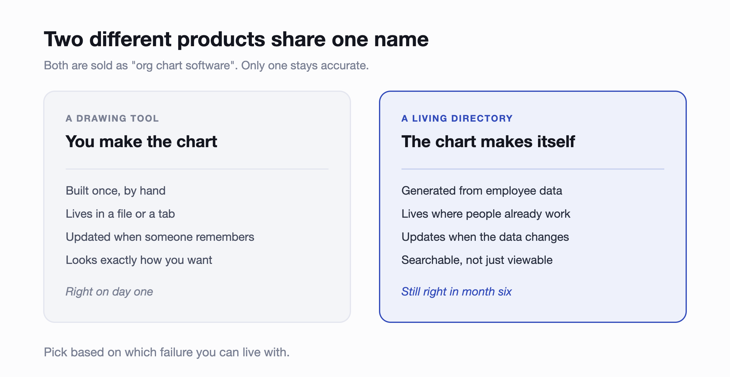
Neither is wrong. If you need a board-ready diagram of a proposed structure, a drawing tool is the right answer and a directory will frustrate you. If you need people to be able to find out who does what on a Tuesday, a drawing tool will be out of date before it's useful.
Most small companies think they're buying the first and actually need the second.
What "stays accurate" actually requires
Any tool can claim to sync. What matters is the plumbing underneath, and there are three questions worth asking.
Where does the structure come from?
Something has to be the source of truth. If you run an HRIS, that's it, and the chart should read from it rather than duplicate it. If you don't, the practical source is usually your chat tool, since it's the one system that's genuinely current for everyone. What you want to avoid is a third list that has to be maintained separately, because that's the one that rots.
Who has to do something for it to update?
This is the question that predicts whether the chart survives. If updating means someone opens an editor and drags a box, it will be wrong. If someone joining or changing role updates it automatically, it stays right. Any tool where accuracy depends on a human remembering has the same failure mode as the spreadsheet you're replacing.
What happens to the gaps?
Real employee data is patchy. People don't fill in job titles, departments get renamed, someone's manager field is empty. The useful behaviour is for the tool to notice and ask the person directly, rather than leaving a hole in the chart that HR discovers later.
What to actually look for
Assuming you've decided you want a directory rather than a diagram, this is the shortlist that matters at 30 to 200 people. Most of the enterprise feature lists you'll read are aimed at a much bigger company.
- Search that works on more than names. Finding someone by skill, department or location is what turns a chart into a tool people use.
- Profiles worth reading. Title and manager are the minimum. Skills, location, time zone and what someone actually works on are what stop the "who do I ask" question.
- Automatic updates from your existing data, whether that's an HRIS or your chat tool.
- Prompts for missing information, so gaps get filled by the person who knows the answer.
- Permissions. Some fields shouldn't be editable by everyone, and some shouldn't be visible to everyone.
- A private mode for planning. Reorgs and headcount planning shouldn't happen on the live chart.
- Export, for the board deck you'll eventually be asked for.
Notice what isn't on that list: dotted-line reporting, succession planning, compensation overlays, scenario modelling. Those are real features and they matter at two thousand people. At fifty, they're the reason the tool costs what it costs.
Where the chart earns its keep
The diagram is the least interesting output. What a current directory actually buys you shows up in three places.
Onboarding. A new hire's first two weeks are mostly working out who to talk to. A searchable directory with real profiles compresses that from weeks of asking to a few minutes of looking. It's the single clearest return, and it's why onboarding and org charts keep coming up together.
Cross-team work. Past about forty people, nobody knows the whole company any more. The moment someone needs a person from a team they've never worked with, the chart is either useful or it isn't.
Noticing structural drift. When you can see the whole thing, you notice the manager with eleven direct reports, or the team that's quietly become two teams. That's a planning conversation you can only have if the picture is current.
What org chart software won't fix
Worth saying plainly, because the category oversells itself. A chart shows the structure you have. It doesn't tell you whether that structure is any good, and drawing an unclear reporting line neatly doesn't make it clear.
If two people both think they own something, an accurate chart will show you two names and no answer. If a team has grown past what one manager can hold, the chart will show it and then wait for you to do something. It's a diagnostic, not a treatment.
Common questions
Can we just use a spreadsheet or a slide?
Under about twenty people, yes, and you probably should. The tipping point isn't headcount exactly, it's the rate of change. If people join or move often enough that the file is wrong most of the time, it has stopped being a record and become a source of confusion.
Do we need this if we already have an HRIS?
Your HRIS knows the structure but almost nobody outside HR logs into it, which means the data is right and unused. A directory sitting on top of it, in the tool everyone already has open, is what makes it available to the people who need it. Keep the HRIS as the source of truth and sync from it.
How long does setup take?
If the tool builds from data you already have, minutes rather than a project. If you're being quoted an implementation timeline to display information you already own, that's a signal about who the product is built for.
What about drawing tools we already pay for?
Keep them for what they're good at. Modelling a proposed reorg, or a diagram for a board pack, is genuinely a diagramming job. We wrote about where Miro works for org charts and where it doesn't, and the answer is roughly this split.
Where to start
Work out which of the two products you're actually shopping for. If the chart's job is to look right in a presentation, buy a drawing tool. If its job is to answer "who do I ask about this" for the next two years, buy something that maintains itself, and check the update question before the feature list.
If your team already lives in Slack or Teams, the shortest path is a directory that builds from the workspace you're in, then syncs from your HRIS once you have one. We compared the main options, and there's a walkthrough of building one without losing an afternoon to it.
The org chart is one piece of a larger pattern. Most of the admin that eats a small people team is recurring, low-stakes and automatable, and we covered how to work out which parts to tackle first in our guide to HR automation for small business.